

Hertz Design System
Goal / Build a design system for all Hertz platforms with ability to reskin for our other brands.
SUMMER 2021 - SPRING 2022
Responsibilities
Facilitate switch from Adobe XD to Figma
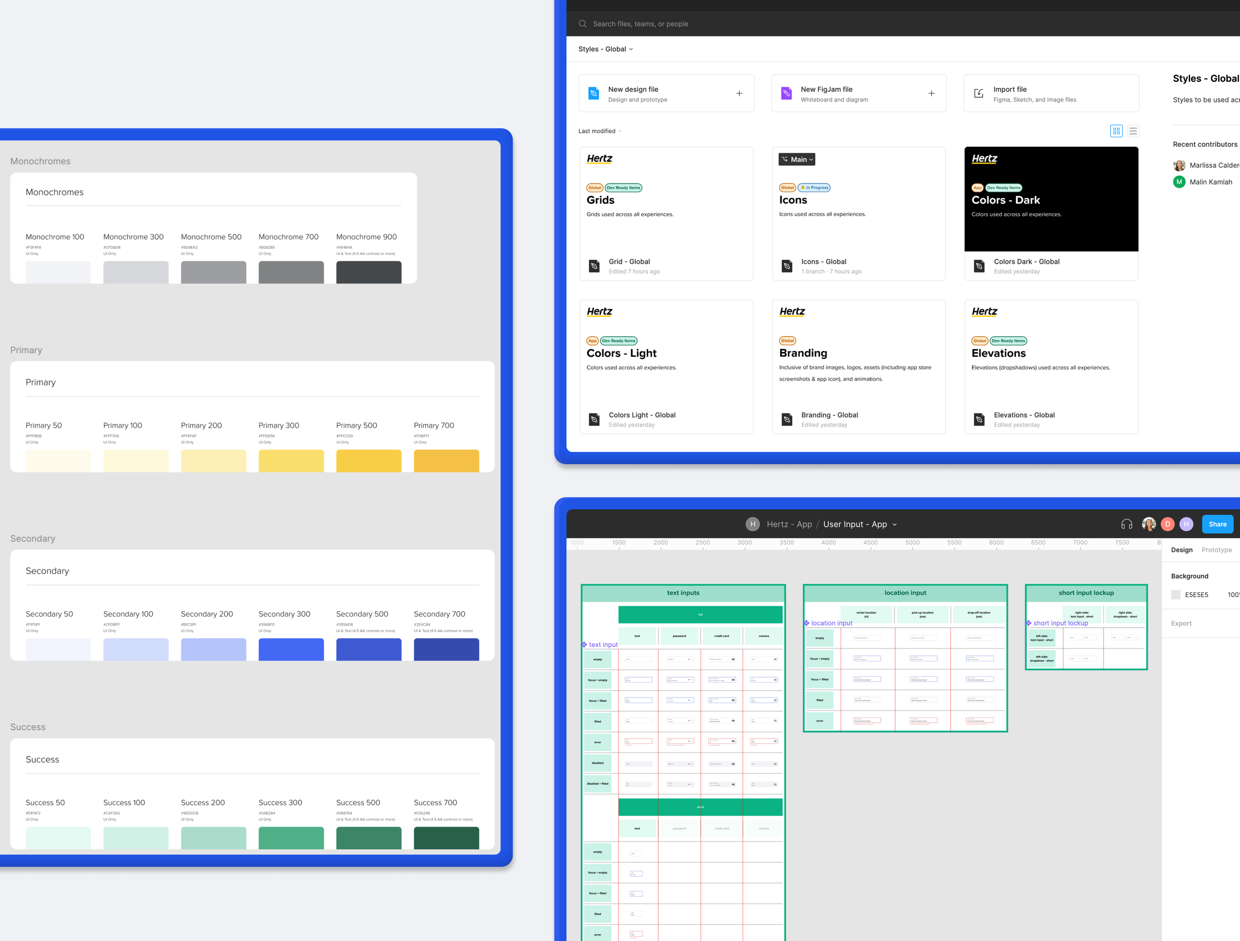
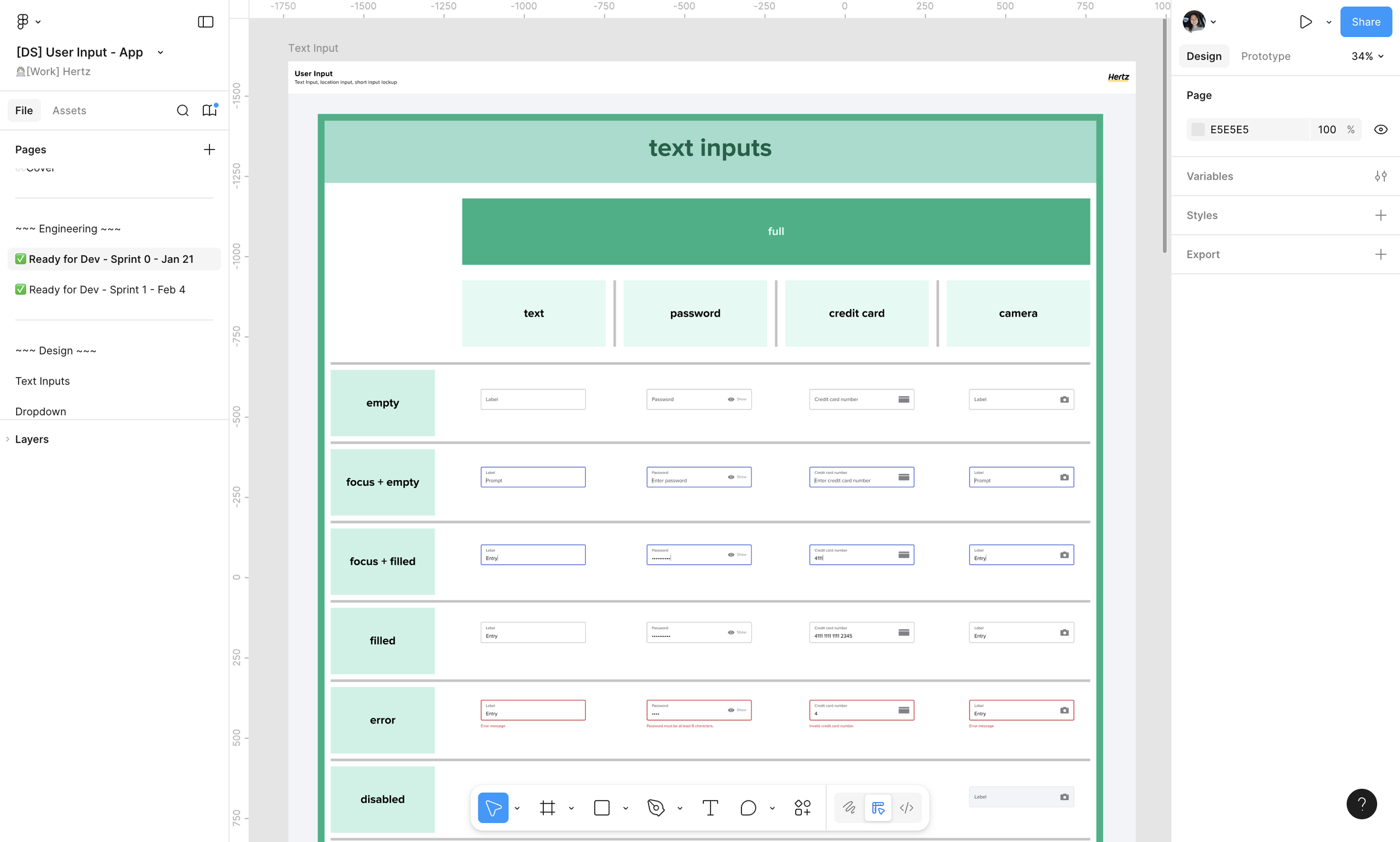
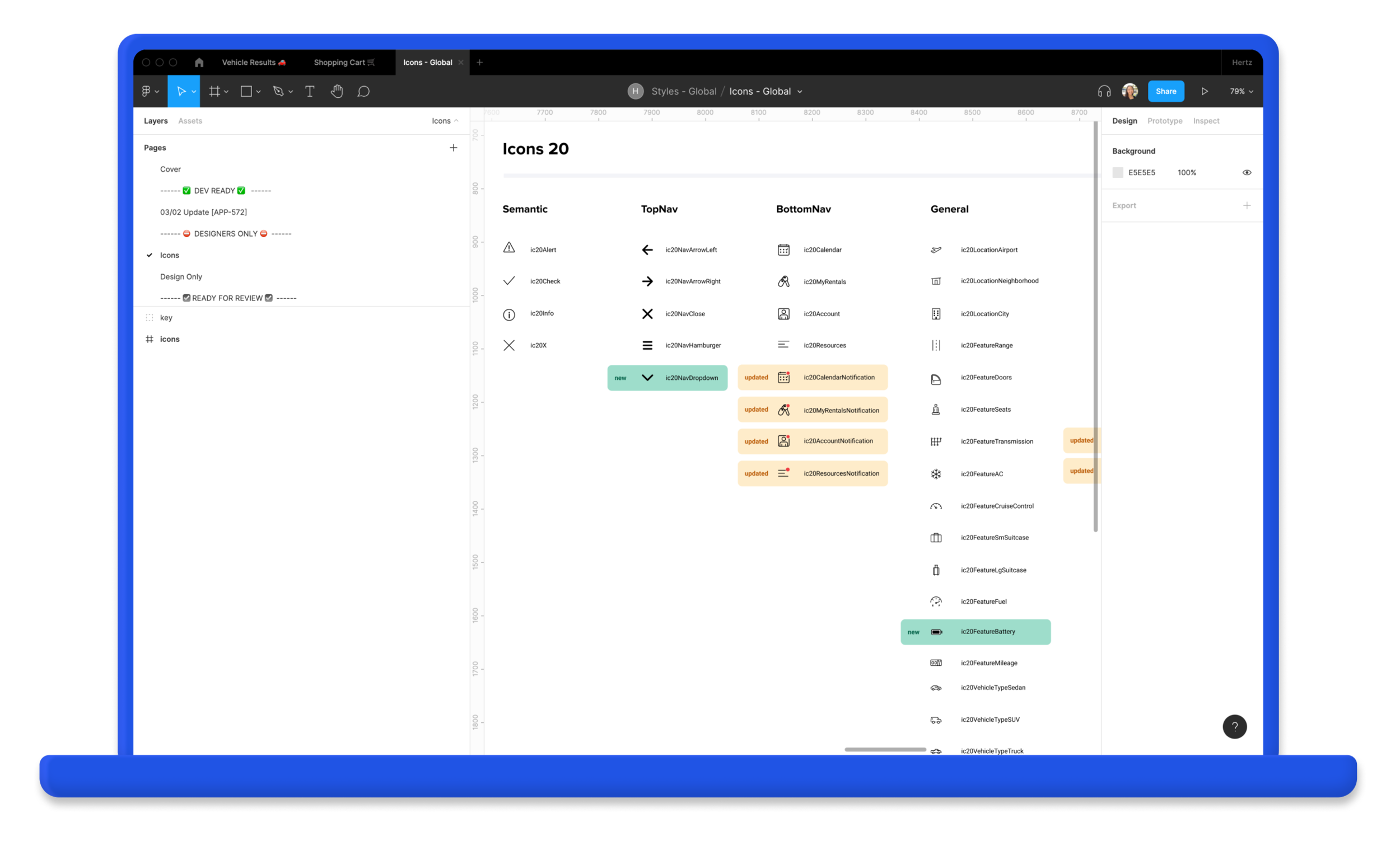
Create design system starting with native app components
Process
Creation
Elements + components were broken into different files. Notes were added by any components that were updated from the last dev hand-off.
Development
Components were built in Storybook + demos were held for feedback. Links were also shared out for testing components in our own time.
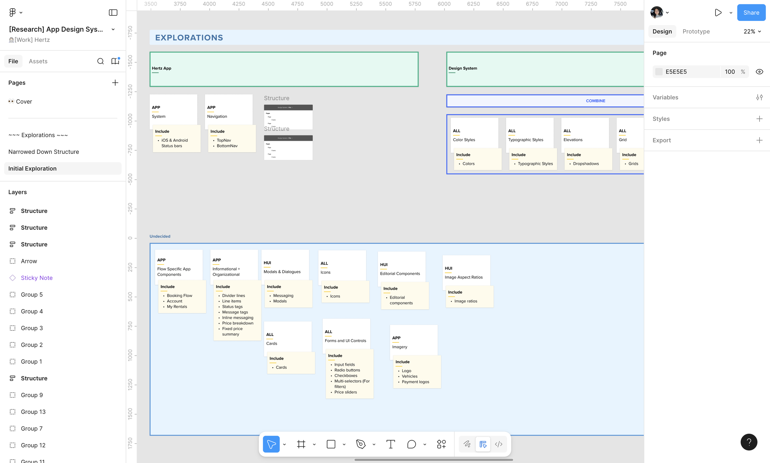
Discovery
Before creating the Design System, we would go through collaboration sessions to determine where all components would fit. This exercise was similar to card sorting exercises. Through this we were able to properly categorize each component.
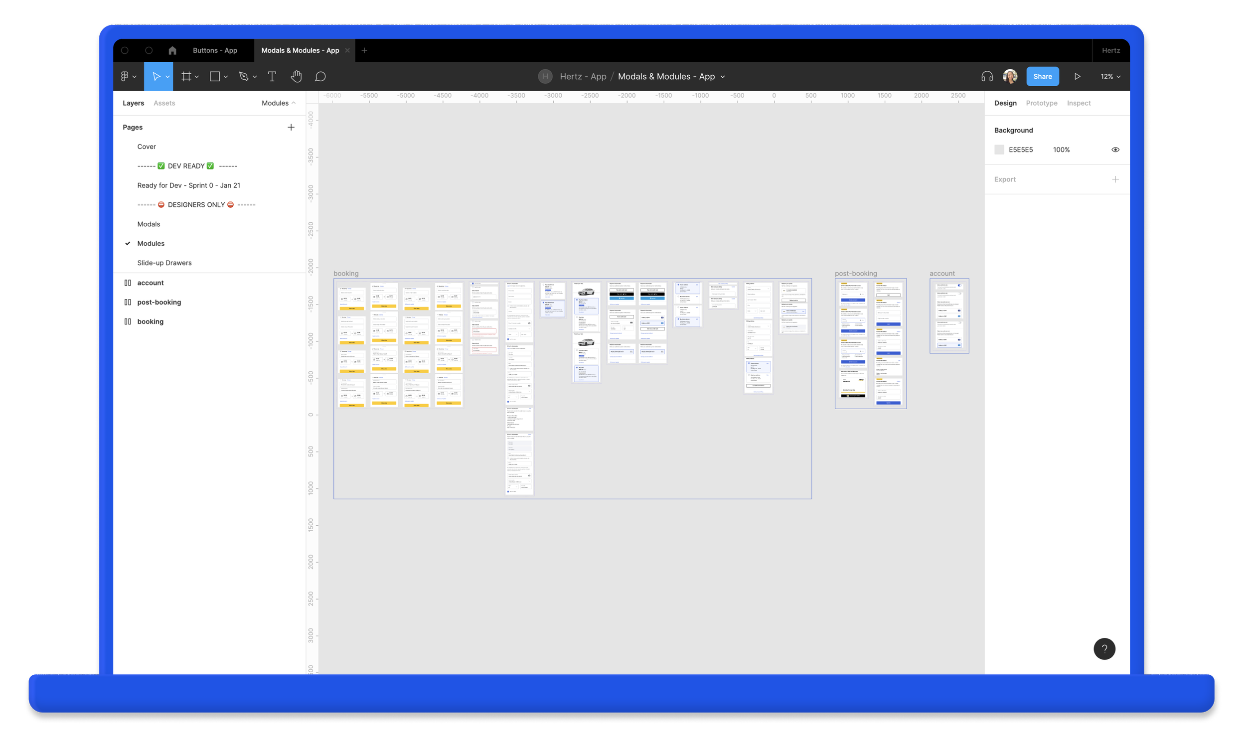
Handoff
When components were ready to go to development, we would mark the components as ready for dev and notate what sprint these would be added to.
At the time, Figma had not yet introduced the Ready for Dev tag so we would use component instances in our handoffs so we could keep a record of the updates we made without messing with the published components.
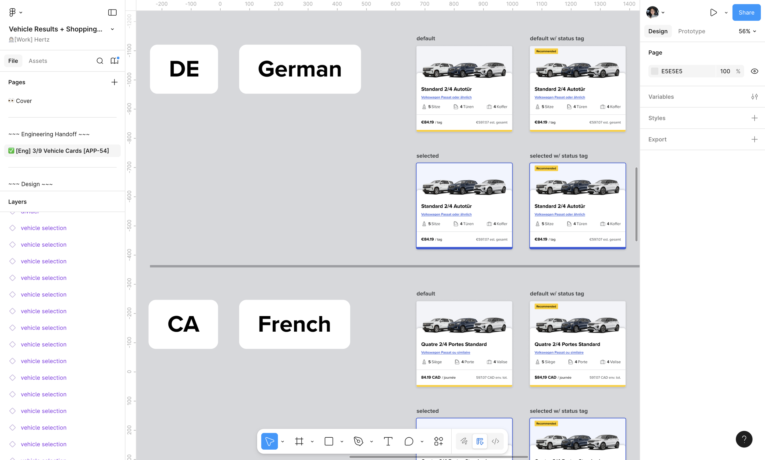
International Considerations
While creating components, we kept in mind the other languages that the components would be translated to. This helped us figure out the right text sizes to use and the best placements for elements.
The Tools
-
Figma
Design tool.
-
Figma Export
Plugin used by Developers to create Design Tokens quickly.
-
Jira + Confluence
Used to keep track of tasks, the backlog, + document our processes.
-
Zeroheight
Documentation of design system components + reusable code. Shared out to vendors + partners for Brand guidelines.
-
Storybook
Where reusable coded components live. Used by the developers.
